The CSS transform property allows developers to rotate, scale, and skew blocks of HTML via CSS. Although you can do the same thing with images in Photoshop or The GIMP, using CSS transforms allows developers to do the same thing with any HTML markup and allows users to select the text within the transformed object.
When I first saw sites using transform, I looked at the underlying code and tried to produce pages using transform in all browsers. Although Firefox, Opera and Webkit based browser support it via vendor-specific prefixes (using -moz-transform, -o-transform and -webkit-transform respectively) Internet Explorer doesn’t support it at all. I didn’t like that, so I took out my JavaScript whip, beat Explorer into submission and made it do my bidding (but not without getting a few mental bruises of my own).
Before I start talking about the details of my solution, let’s take a look at a few examples of it in action. The following code has been tested with Firefox 3.5, Safari 4, Chrome 4, Internet Explorer 6 and higher.
- Rotations Example
- Skew Example
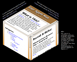
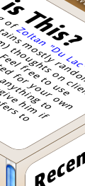
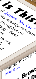
- Cube Example, using rotates and skews
- Another example that looks like a CSS3 version of a Geocities page.
(The examples also work on my copy of Opera 10.5, although I have seen it fail on other installations – I will update this post when I find out why).
cssSandpaper to the Rescue
I saw the design potential of using CSS transforms and was frustrated at Explorer’s lack of support. I originally tried a non-JavaScript solution which involved creating CSS rules that combine transform with an IE technology that does something similar: the DXImageTransform.Microsoft.Matrix CSS filter.
I then, to steal a phrase from Russel Peters, started to Hurt Real Bad:
- the syntax of
transformis very obvious:#myObject {
transform: rotate(40deg) scale(2.0);
}but the IE filter code is quite intimidating:
#myObject {
  filter: progid:DXImageTransform.Microsoft.Matrix(sizingMethod='auto expand',
       M11=1.5320888862379554, M12=-1.2855752193730787,
       M21=1.2855752193730796, M22=1.5320888862379558);
}
The scary numbers that the
DXImageTransform.Microsoft.Matrixfilter uses requires knowledge of matrix and vector mathematics. Even though there is a great Wikipedia article on the subject, even the mathematically gifted wouldn’t want to do the calculations to do a simple rotate in CSS (I would like to note here that even though I have a university degree in Mathematics, I hate doing arithmetic inside my head. If you don’t believe me, watch me figure out a tip at a restaurant sometime. I’m not kidding). - although it is possible to have a list of transformations using
transform, theDXImageTransform.Microsoft.Matrixfilter only allows one transform matrix. In order to implement multiple transforms using one filter, a designer would have to convert all the transforms into matrices and multiply them together. Again, as ugly as I am when I first wake up in the morning. - when rotating, skewing, or doing any other transformations on objects using the
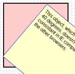
transformproperty, the center of the object remains fixed. However, theMatrixfilter doesn’t keep the centre of the transformed object fixed, as seen by the illustration below:Rotate using CSS transform Rotate using IE Filter 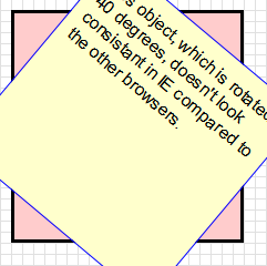
I was about to give up on my endeavor until I read Weston Ruter’s clever CSS Gradients in Canvas article, which implements gradients in older versions Firefox and Opera. What I really liked was how he used the CSS from a web page to place the canvas gradients in the page (as opposed to using CSS classes to indicate where the gradients should go). I then thought it would be a great idea to do the same with CSS transforms – why not have JavaScript find out which objects are transformed by reading the style sheets containing the transform rules, and if the browser is Internet Explorer, apply the Matrix filter, while translating the image so that the center is maintained. How hard could it be …….. right?
After a few obsessive months of coding, coffee drinking and Asprin popping (as well angrily asking myself on several occasions why the &@$! I would wanted to do this in the first place), I created cssSandpaper.js, a library that implements transform (and some other CSS3 properties) as consistently as possible in all browsers. It uses many ideas from Ruter’s gradient script, as well as sylvester.js, James Coglan’s brilliant matrix and vector math library.
The code is currently in a beta stage, but I think that it’s in good enough shape that developers can start to play around with these really cool effects today and have it work in almost any browser.
Browser Differences
After I finished cssSandpaper and played around with transforms, I found some slight differences in the way browsers handled them:
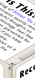
- If you transform an object with scrollbars, it is possible to scroll the object in most browsers in most cases. However, in the cube page I mocked up, I noticed the following behaviour:
- the left facing side of the cube isn’t easily accessible in IE.
- the scrollbars don’t appear at all in Opera.
- the scrollbars are not quite clear in Chrome for Windows, although one can still scroll the sides if you can guess where they are.
- Firefox 3.5 for Mac puts the scrollbars in strange places (this has been fixed 3.6).
- In Internet Explorer, the text is selectable but sometimes it takes a few tries to figure out how to do it (try selecting text with IE in my cube mockup and you’ll see what I mean).
- When selecting text within Firefox, the text tends to jump around ever so slightly for some odd reason (this is quite a subtle effect that it is probably not noticeable in most instances).
- It looks like Internet Explorer takes the block of HTML, converts it to an image and then does the transform (I’m not sure .. I’m guessing). As a result, the text in certain situations will look a little blurry, especially if scaling is involved.
As to be expected, the rendering of the transformed text in the other browsers slightly differs:
Using cssSandpaper
After downloading the archive you must put the following tags into the head of your document after all of your style sheet declarations (this is to ensure the JavaScripts will run after the style sheets are loaded):
You can then use the transform property in your web pages. Note that since the specification for the transform property is finalized by the W3C, I decided to use the vendor-specific prefix -sand- before each CSS3 property it supports.
The following is a description of how to use transform, as well as two other CSS3 properties that cssSandpaper supports, box-shadow and gradient.
Download version 1.0 beta of cssSandpaper
-sand-transform
Description
Transforms allow developers to rotate, scale, and skew blocks of HTML via CSS.
Syntax
#container {
-sand-transform:
} where
| Function | Purpose |
|---|---|
rotate(angle) | Rotates HTML elements. angle can be in degrees (e.g. rotate(30deg)) or radians rotate(1.3rad) |
scale(sx[, sy]) | Scales HTML elements. sx and sy are numbers, where 1 represents the original size, 2 represents twice the size, etc. Note that if sy isn’t specified, it is assumed to be equal to sx. Similar functions are scaleX(sx) and scaleY(sy). |
skew(ax[, ay]) | Skews the object around the x and y axes by the specified angles in degrees or radians. If ay isn’t provided, it is assumed to be 0deg. |
matrix(a, c, b, d, tx, ty) | Applies a 2D transformation matrix comprised of the specified six values. If you aren’t familiar with linear algebra and matrix arithmetic, this function will be hard to understand. For further information, you may want to read Wikipedia’s Transformation Matrix article, although if you are mathematically challenged, you may run away from your computer screaming. If you are familiar with matrix multiplication, note that c and b are reversed. This follows the way Firefox has implemented this method (i believe WebKit based browsers reverse these numbers). |
Note: non-Explorer browsers support the translate function as well. I have not been able to find a way to make this work IE at this time, due to a technical issue with the IE’s Matrix filter property (for those who want details, I use sizingMethod='auto expand' when using the Matrix filter which doesn’t support translations, and using sizingMethod=’crop’ is not suitable to emulate the transform property). For this reason, the tx and ty values of the matrix() function are not supported as well.
Examples
-sand-box-shadow
Description
box-shadow allows us to take a block level element and put a shadow underneath. There can optionally set a blur factor to give a warmer effect to the shadow.
Syntax
#container {
  -sand-box-shadow:
;
}
Note that in IE, the blur-radius is not supported, due to a lack of support in IE’s DropShadow filter.
Examples
-sand-gradient
Description
Gradients are gradual blends of color, and can be linear or radial:
Syntax
#container {
  background-image: -sand-gradient(, , , , , ..., )
}
The type can be linear and gradient, although Internet Explorer doesn’t support radial gradients at this time, due to limitations in IE’s gradient filter. Internet Explorer also only supports simple linear gradients (i.e. only horizontal and vertical and only two colours).
A more detailed explanation can be found in the section regarding gradients of the W3C’s working draft of CSS Image Values Module Level 3
Examples
Other Known Issues
- Currently, when a users changes the font-size in IE, the layout gets a little messed up. This will be fixed in a future release.
- Scripting in IE cannot be done via the usual
obj.style.transform. There is, however, an alternative way of scripting the cssSandpaper supported properties which will be outlined in a future blog post (I don’t mean to keep anyone in suspense … it’s just that I feel like I’ve spent too much time on this post and I want to get at least this part out the door :-) ). - Opera 10.5 sort of works. It works on my copy, but not on another copy I’ve seen. I don’t know why yet, but I will find out soon and post and update when I do.
- Weston Ruter’s gradient script has more features. I will incorporate them in a future release.
Future Work
cssSandpaper will eventually be about more than just transforms – I would like to be able to support other advanced CSS topics (maybe even animations, if it is possible). It probably has a few bugs in it – I would really appreciate anyone letting me know if you find any (my e-mail address is at the top left part of the page).
If anyone would like to get contribute code or do testing, I would love the help too. :-)
Acknowledgments
I would like to thank Weston Ruter for his CSS Gradients in Canvas script, since I stole many of his ideas with his permission (I will be implementing more of the advanced features of his script in a future release of CSS3Sandbox). I would also like to thank James Coglan for building Sylvester so I didn’t have to.
Downloads
Go to the cssSandpaper documentation to download the latest version.







No comments:
Post a Comment